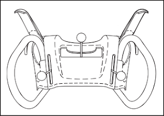
Simple doesn't imply intuitive

As I was pushing snow I started to think about the user interface for the snowblower. Turns-out that a snowblower is a pretty simple machine. There are basically 5 functions:
- Start throwing snow (auger control)
- Start moving (drive clutch)
- Direct the flow of snow (chute direction)
- Control the speed of the engine (throttle)
- Control the direction of movement (forward, backward)
Each of the functions is controlled by a lever and the user feedback is pretty direct. Push the lever; Machine reacts. Like I said, a pretty simple machine.
However, I'd be hard pressed to call this UI intuitive. I don't think that someone, being put in front of a snowblower for the first time, can intuit how it works without being taught or without reading the manual. I find it interesting that, when designing User Interfaces for software, we often assume that something intuitive has to be so obvious that it is self explanatory.
So, simple doesn't always imply intuitive.
Well, maybe. If you look at the definition of the word intuitive in the dictionary, it reads: readily learned or understood.
With this new definition, the snowblower's UI becomes intuitive. It does require that my neighbour's boy learn how it works but its simplicity makes it easy for the him to learn and understand how the machine reacts to his actions.